Low-vision reading is not one fixed experience. Good digital reading supports zoom, reflow, strong contrast, comfortable spacing and audio without forcing a single mode.
Start by respecting variation
Low vision describes many different experiences. One reader may need larger text; another may need stronger contrast or less glare; someone else may rely mainly on speech. A site cannot predict one perfect setting, so it should avoid blocking the settings people already use.
That means layouts that reflow at high zoom, controls that remain visible, labels that do not clip, and text that does not require horizontal scrolling on an ordinary page.
Size matters, but space matters too
Small grey copy is a common design habit because it can make a layout look refined in a screenshot. In use, it creates work. Important descriptions, labels and instructions deserve a comfortable size and meaningful contrast.
Line height and paragraph spacing help readers track from one line to the next. Narrower text columns also reduce the distance the eye must travel before finding the start of the following line.
Accessible typography is not an “extra large” mode added later. It begins with ordinary copy that is comfortable enough to read.
Audio adds another route through the same information
RNIB describes audio, large print, braille and digital formats as different ways people may choose to read. The key word is choose. Text-to-speech does not make visual design irrelevant, and visual access does not make audio unnecessary.
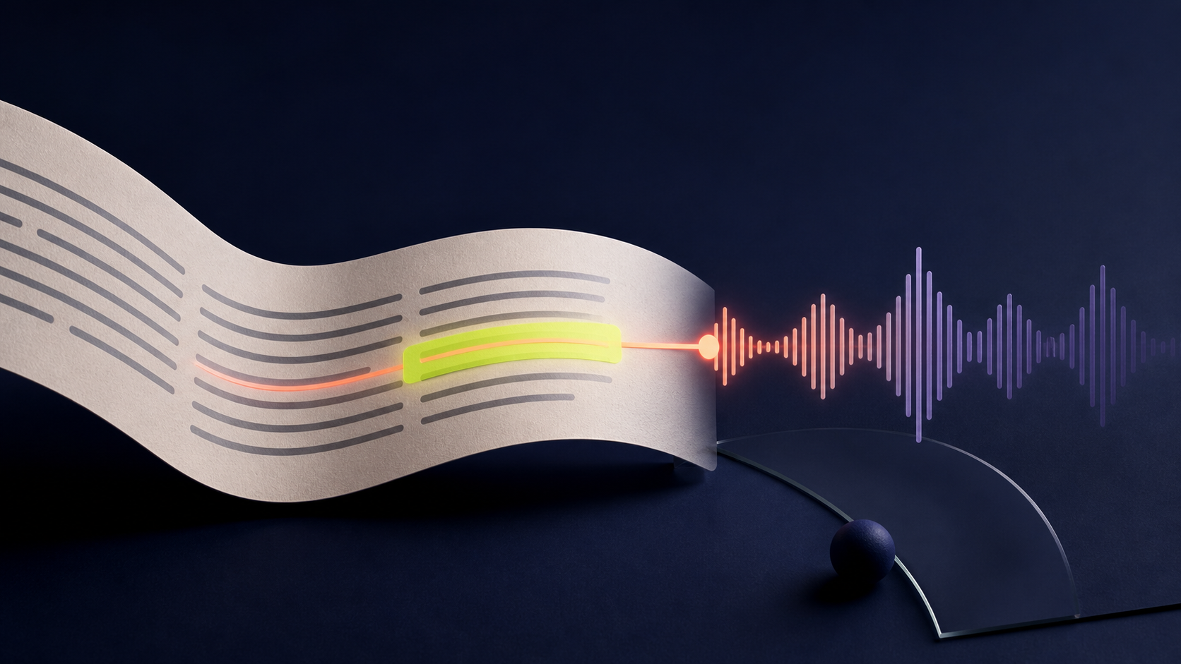
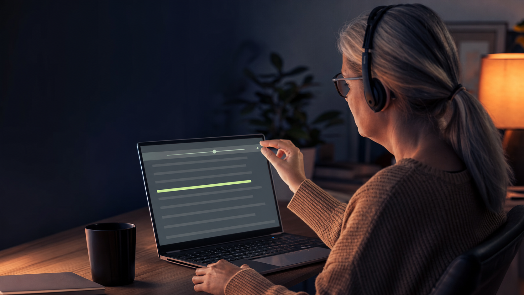
A webpage reader can be helpful when magnification makes scanning slow, when the eyes are tired, or when a person wants to check the written form while hearing the sentence. Keeping the highlight on the original page preserves context.
Orientation should survive zoom and movement
Magnification reduces how much of a page is visible at once. Sudden scrolling can therefore be disorienting. A follow-along tool should move only when necessary and keep enough surrounding text visible to explain where the current word sits.
- Use stable headings and a predictable reading order.
- Do not hide essential controls on hover alone.
- Let people pause movement without stopping audio.
- Keep focus indicators clear for keyboard users.
What we changed on this site
We increased the size and contrast of explanatory copy, removed tiny body text from comparison cards, let article titles wrap, and designed this journal with a generous reading column. These are not special features for one group. They make the experience calmer for almost everyone.